Origin & Build Decision
Why stitchwand exists, what it replaces, and the prototype lineage that led to v0.9. This is the pre-build story — Kenos Method Phase 0, captured from the repository's own git history and the surviving PRD documents in the project root.
Origin Story
Stitchwand began life as Stitch Tools — the first commit (61bea74: "Initial commit: Stitch Tools app with docs and landing page") established a monorepo with apps/web and a self-contained docs/ folder. The project was renamed to Stitch Wand in commit 04bd33a, and the wand SVG identity shipped in 12a9bf9.
The founding insight: DESIGN.md is to design systems what README.md is to code. AI coding agents (Cursor, Claude Code, Copilot, Gemini CLI) generate UI constantly but have no structured way to consume design-system context. Every existing tool in the space (Figma Tokens, Style Dictionary, token studios) targets humans or build pipelines, not the coding agents that now write most of the UI. Stitchwand exists to close that gap — by generating a single markdown file that encodes colors, spacing, typography, components, and voice in a form AI agents can read and reason over.
The launch window is non-negotiable: Google Cloud Next, April 22–26. Feature freeze April 14, soft launch April 18, LinkedIn announce April 21, conference coverage April 22–26.
Competitor Snapshot
At the time of writing, there are no direct competitors building AI-consumable design-system context files as a formalized standard. The adjacent landscape:
No direct competitor is shipping a DESIGN.md standard targeted at AI coding agents. The category is emerging and necessary, and there is a clear time-bounded market window (Google Cloud Next) to plant a first-mover flag. Build decision: ship v0.9 before the conference.
PRD Reference
The product requirements are distributed across four living documents in the project root. They are the authoritative source — the content below is a summary, not a replacement.
OVERVIEW.mdAUTH_PLAN.mdV0.9-LAUNCH-PLAN.mdCLAUDE.mdIf any section of this Genesis tab drifts from the live PRD documents, the PRDs win. Re-run the make-docs skill or update this tab by hand to re-sync. Flag for human review: [NEEDS INPUT: verify against current OVERVIEW.md] wherever an ambiguity is noticed.
Prototype Lineage
Four meaningful prototype generations from the git history. Each row represents a paradigm shift, not an incremental commit. See the Builds doc for the interactive prototype tracker and the released builds timeline.
| Version | Paradigm | Theme | Tool | What was tested | Outcome |
|---|---|---|---|---|---|
| v0.1 | Portal / Hub | Editorial / Press | Handwritten HTML · stitch.tools |
Can a docs-first landing page carry the narrative? | Abandoned — renamed |
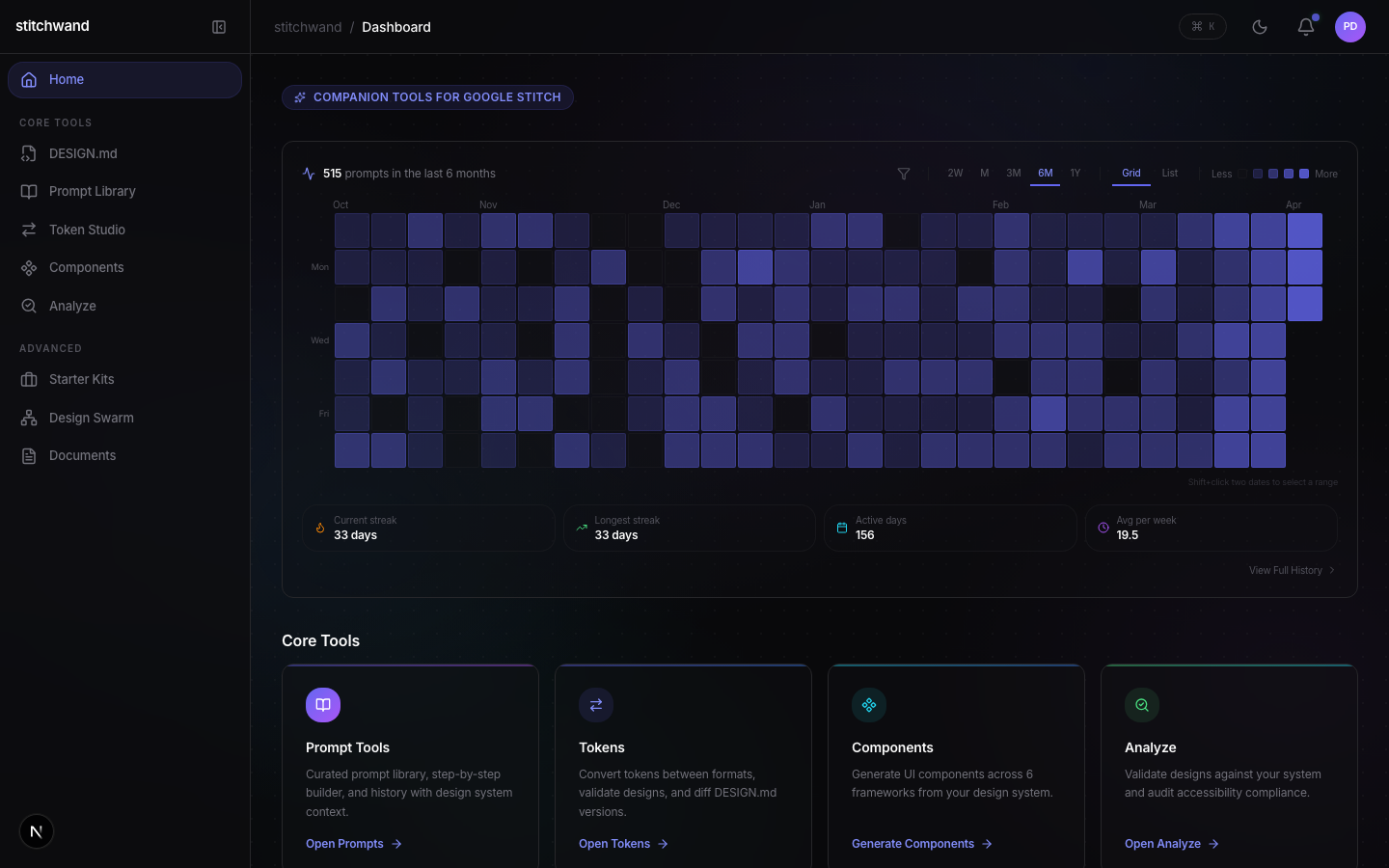
| v0.2 | Dashboard | Dark Command | Next.js + Stitchwand rebrand | Does the "Stitchwand" name + wand identity read better? | In progress — rebrand stuck |
| v0.3 | Multi-Agent Workspace | Dark Command | Claude Code + 5 git worktrees | Can 5 parallel agents build a dashboard faster than 1? | Winner — current build methodology |
| v0.9 | Dashboard + Command Palette | Dark Command + Startup/Modern | Next.js 16 · React 19 · Tailwind 4 | Is the current surface shippable at Google Cloud Next? | Winner — shipping |
Naming Record
Final name: Stitchwand. Domain: stitch.tools (active since commit 984dfaa).
04bd33a.Build Decision
The build decision was made when the Google Cloud Next announcement created a time-bounded market window and the competitor scan came back clean. The validating commitment: dogfood Google Stitch — use the same tool stitchwand targets to design stitchwand's own UI. First meaningful milestone: v0.9 dashboard feature-complete with 35+ pages, admin panel, demo mode, and the community system gallery.
Green light on competitor scan · PRDs written (OVERVIEW.md, AUTH_PLAN.md, V0.9-LAUNCH-PLAN.md, CLAUDE.md) · Name + domain locked (Stitchwand, stitch.tools) · Winning prototype paradigm identified (dashboard + command palette) · Build methodology validated (5-agent Claude Code worktrees, see AGENTS-SETUP-REPORT.md) · Launch date committed (April 18).
Last updated: 2026-04-11 · Added as part of the Kenos Method Phase 0 Genesis pass.
How stitchwand Is Built
A monorepo architecture where a pure TypeScript core engine powers every surface — MCP server, CLI, and web application. All processing lives in @stitchwand/core; every surface is a thin wrapper.
System Architecture
The architecture follows a strict layering principle: the core engine has no knowledge of its consumers. Each surface layer (MCP, CLI, Web) adapts the engine's API to its transport mechanism.
stdio transport
commander.js
Next.js POST
convert • validate • diff • parse • lint
31 pages → API Routes → Core Engine
The web app calls the core engine through API routes, not directly from client components. This ensures the same code path is used whether the request comes from a browser, an MCP client, or a CLI invocation. The core engine never needs browser APIs.
Monorepo Structure
The project uses an npm workspace monorepo managed by Turborepo. Each package has clear boundaries and a single responsibility.
Data Flow
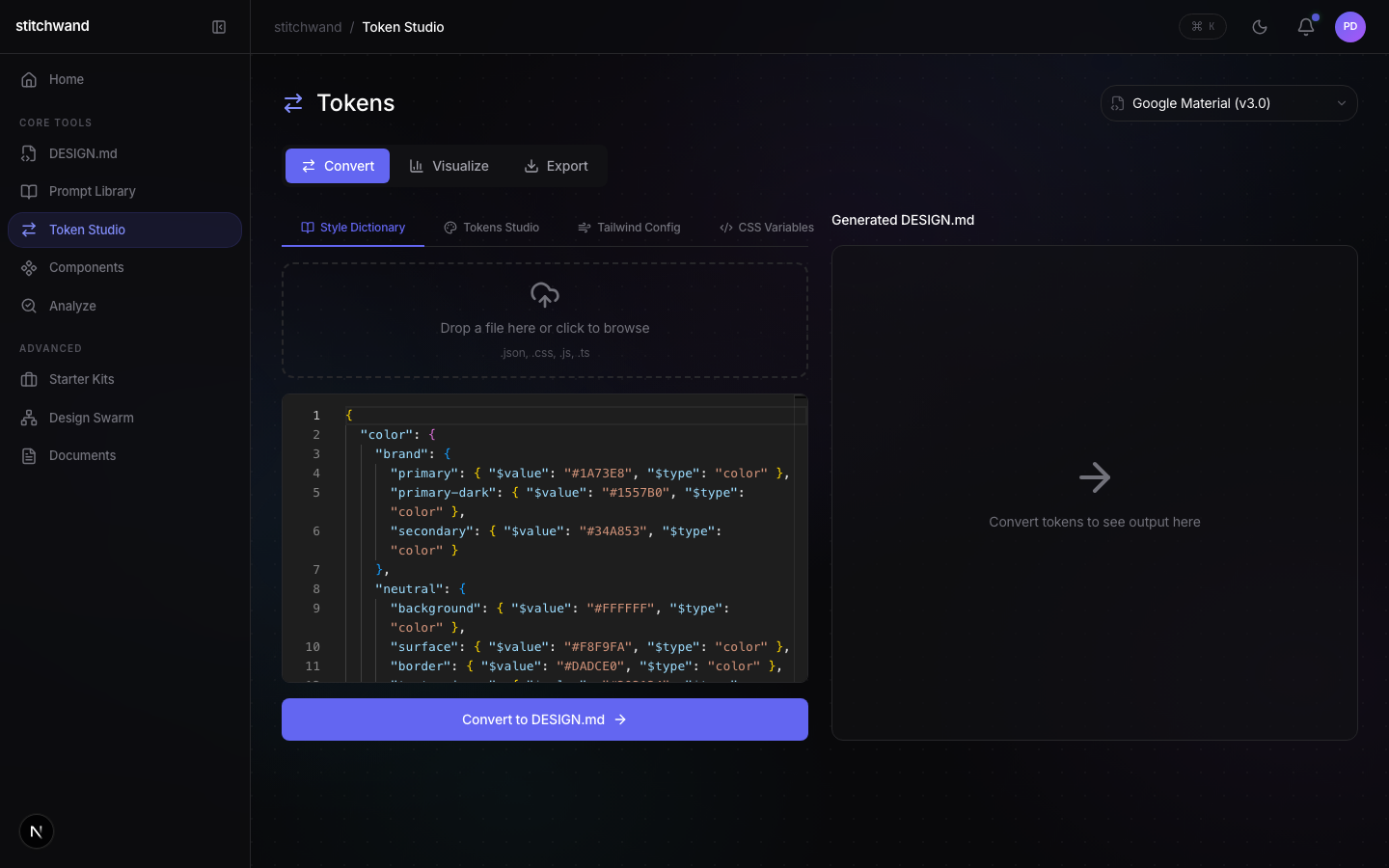
Convert: Tokens → DESIGN.md
JSON / CSS / JS
format detect
normalized
semantic layer
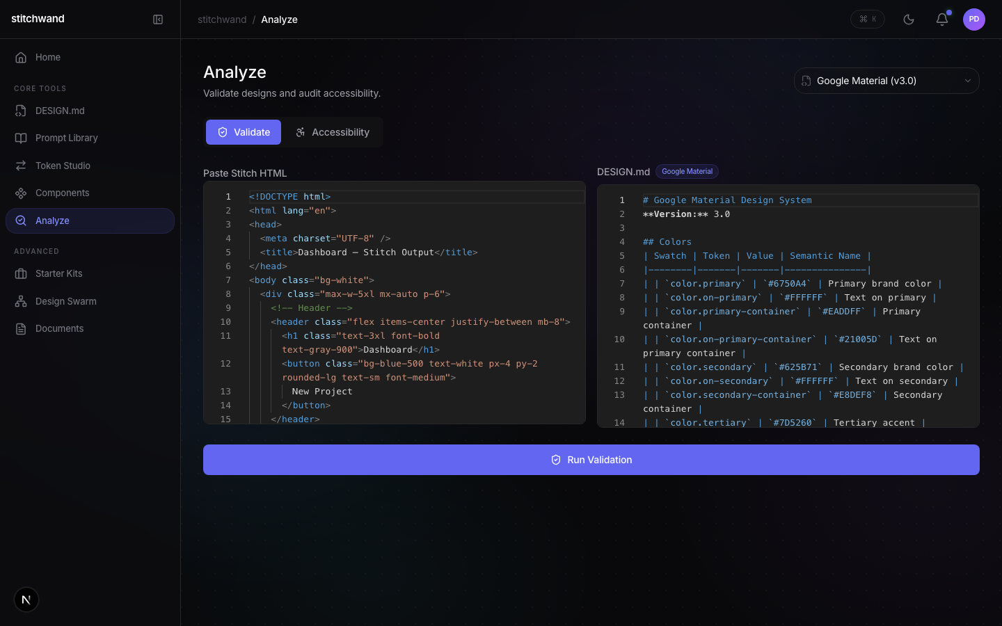
Validate: HTML → Grade
parse & traverse
parallel eval
+ violations
Diff: System A vs System B
Matching
additions, removals, modifications
Tech Stack
any types. Result<T, E> error handling pattern throughout.__tests__/ directories.@modelcontextprotocol/sdk with stdio transport. Zod schemas for input validation on all tools.Design Principles
@stitchwand/core with zero platform dependencies. MCP, CLI, and web are thin wrappers. Same code runs in Claude Code, GitHub Actions, or a browser.The Token Processing Pipeline
Convert design tokens from four formats into semantic DESIGN.md. Validate AI-generated HTML against your design system. Diff two systems to track changes over time.
Token Conversion
Design tokens exist in four widely-used formats. The conversion engine normalizes, resolves references, generates semantic names, and produces DESIGN.md output.
| Format | Structure | Reference Syntax | Prevalence |
|---|---|---|---|
| Style Dictionary | Nested JSON with $value | {color.primary.500} | Very Common |
| Tokens Studio | Nested JSON with value | {colors.primary.500} | Common |
| Tailwind | Flat theme config object | None (direct values) | Very Common |
| CSS Variables | Flat :root declarations | var(--color-primary) | Common |
Two-Pass Reference Resolution
Token files frequently contain references where one token points to another. The engine uses a two-pass algorithm with circular reference detection.
Semantic Name Generation
Raw token values are enriched with human-readable names using color-namer and HSL-based fallbacks for colors, and descriptive threshold labels for spacing.
| Hex Value | Raw Name | Semantic Name |
|---|---|---|
#1A73E8 | color-primary-500 | Deep Ocean |
#34D399 | color-success | Emerald Glow |
#F59E0B | color-warning | Warm Amber |
#09090B | color-bg-dark | Near Black |
DESIGN.md Output
The generator produces six standard sections using natural language with parenthesized values. LLMs perform better with semantic context than structured data.
Validation Engine
Eight validation categories check AI-generated HTML against a DESIGN.md reference. Each violation includes what was expected, what was found, and how to fix it.
Grade Calculation
Scores start at 100, reduced by severity: Critical −10, Serious −5, Moderate −3, Minor −1.
The validator uses cheerio for DOM traversal, not JSDOM. 10× faster and sufficient for inline-style inspection, which is all AI tools like Stitch output.
Type System & Public API
A small set of well-defined TypeScript interfaces govern all data flowing through the system. Strict typing with zero any and a Result<T, E> error handling pattern.
Core Type Definitions
Package Dependency Graph
Dependencies are strictly one-directional. The core package has no internal dependencies. Surface packages depend only on core.
+ @modelcontextprotocol/sdk, zod
+ commander, chalk, ora
+ next, react, framer-motion, tailwindcss
Core Engine External Dependencies
| Package | Purpose | Size Impact |
|---|---|---|
cheerio |
HTML parsing and DOM traversal for validation | ~85KB |
chroma-js |
Color manipulation, deltaE calculation, contrast ratios | ~40KB |
color-namer |
Generating human-readable color names from hex values | ~120KB |
marked |
DESIGN.md Markdown parsing for validation and diff | ~50KB |
Making stitchwand Work Everywhere
MCP (Model Context Protocol) makes stitchwand available as native tools inside any AI-powered development environment. Convert, validate, and diff without leaving your workflow.
What is MCP (Model Context Protocol)?
MCP is an open standard created by Anthropic that defines how AI applications discover and use external tools. Think of it as USB for AI tools — a universal connector that lets any MCP-compatible client (Claude Code, Cursor, Gemini CLI) use any MCP-compatible server (stitchwand, filesystem tools, database tools).
e.g., Claude Code
stdio / SSE
3 tools exposed
execution
Three MCP Tools
Integration Matrix
How stitchwand connects to different environments and at which stage of development:
| Integration | Transport | Convert | Validate | Diff | Status |
|---|---|---|---|---|---|
| Claude Code | MCP (stdio) | ✓ | ✓ | ✓ | Live |
| Cursor | MCP (stdio) | ✓ | ✓ | ✓ | Live |
| Gemini CLI | MCP (stdio) | ✓ | ✓ | ✓ | Live |
| Web App | API Routes | ✓ | ✓ | ✓ | Live |
| CLI | Direct import | ✓ | ✓ | ✓ | Live |
| GitHub Actions | CLI | ✓ | ✓ | ✓ | Planned |
| Google Stitch | Chrome Extension | — | ✓ | — | Phase 2 |
| Figma | Variables API | ✓ | — | ✓ | Phase 4 |
| Windsurf | MCP (stdio) | ✓ | ✓ | ✓ | Testing |
MCP Server Implementation
The MCP server uses the official @modelcontextprotocol/sdk with stdio transport. Each tool is registered with a Zod schema for input validation.
CLI Implementation
The CLI wraps the core engine with commander.js for argument parsing and chalk for styled terminal output.
API Routes
The Next.js web app exposes three POST endpoints, each a thin wrapper around the core engine:
| Endpoint | Method | Body | Response |
|---|---|---|---|
/api/convert |
POST | { tokens, format? } |
{ designMd, stats } |
/api/validate |
POST | { html, designMd } |
{ grade, score, violations } |
/api/diff |
POST | { systemA, systemB } |
{ summary, totalChanges, details } |
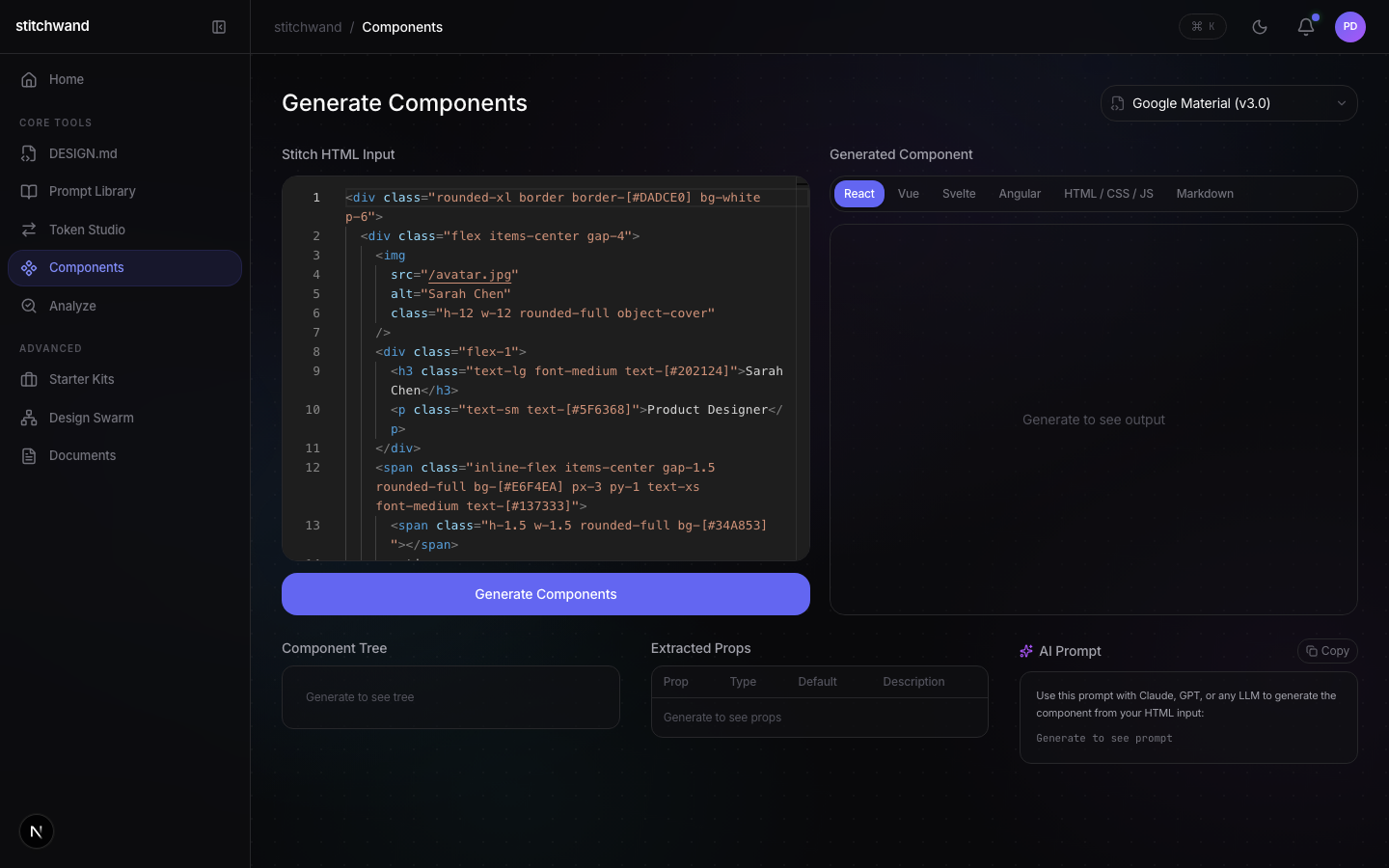
The stitchwand Visual Language
Complete token reference, color palette, typography, spacing, shadows, and component patterns for the stitchwand application. Dual-theme support with dark and light modes.
Color Palette — Dark Mode
Primary application palette. Click any swatch to copy the hex value.
Color Palette — Light Mode
Google AI-inspired palette, Material Design 3-influenced. Used when light theme is active.
Typography
Two font families cover all use cases. Body letter-spacing: -0.011em. Font smoothing: antialiased on all platforms.
Spacing & Border Radius
Consistent spacing and radius scales create visual rhythm across every component.
Shadows
Three elevation levels for dark mode, with lighter variants for light theme.
Component Patterns
Reusable component recipes used throughout the stitchwand interface.
Cards
Surface containers with subtle borders and optional gradient top border on hover.
bg-surface/40 border border-border rounded-xl
Buttons
Three button variants: Primary (filled), Ghost (transparent), and Outline (bordered).
Inputs
Dark-field inputs with subtle borders. Focus state highlights with accent color.
bg-bg-2 border-border rounded-lg focus:border-accent
Badges & Pills
Rounded-full pills for status, tags, and categories. Four semantic variants.
Glass Morphism
Frosted-glass overlays for modals, popovers, and floating panels.
backdrop-blur-xl bg-surface/60
Transitions
Standard easing for all interactive state changes. Consistent timing creates a cohesive feel.
0.2s cubic-bezier(0.4, 0, 0.2, 1)
Animation
Motion design principles for micro-interactions and page transitions.
Page Transitions
Framer Motion fade + translateY entrance. Pages slide up 8px while fading in over 300ms.
initial={{ opacity: 0, y: 8 }}
Staggered Lists
Child items enter sequentially with 40-60ms stagger delay. Creates a cascade effect for grids and lists.
staggerChildren: 0.04
Hover States
150-200ms transition with standard ease. Scale, color, and elevation changes feel immediate but smooth.
transition: all 0.15s ease
Pulse Glow
Notification indicators use a pulsing glow animation. Accent-colored ring scales between 1x and 1.5x.
animation: pulse 2s infinite
Aurora Gradients
Hero backgrounds use slowly moving liquid aurora gradients. Radial gradients shift position over 15-20s loops.
animation: aurora 20s ease infinite
Skeleton Loading
Content placeholders shimmer with a traveling gradient highlight from left to right over 1.5s.
animation: shimmer 1.5s infinite
DESIGN.md Integration
How the stitchwand design system maps to the DESIGN.md format consumed by Google Stitch and AI design agents.
Token Mapping
Each design system section maps directly to a DESIGN.md token category. stitchwand reads and writes these tokens through @stitchwand/core using convert(), validate(), and diff().
Theme Modes
The design system supports dual themes declared as modes: [dark, light] in DESIGN.md. Token values resolve differently per mode, enabling automatic theme switching through Stitch's mode resolution engine.
Google Stitch Usage
When connected to Google Stitch, these tokens are ingested as a DesignSystem object. Stitch uses the token collection to enforce consistency across generated UI, validate designs against the system, and produce accurate diffs when tokens change. The MCP server at @stitchwand/mcp-server exposes these operations to AI agents.
Responsive Breakpoints
| Breakpoint | Width | Behavior |
|---|---|---|
| Desktop | > 1024px | Full layout, max-width 1140px, side-by-side grids |
| Tablet | 769px – 1024px | Reduced grid columns, maintained padding |
| Mobile | ≤ 768px | Single column, stacked layouts, tab scroll |
Additional Notes
How the Documentation Is Built
Every doc is a single self-contained HTML file with no external dependencies beyond Google Fonts. No build step, no framework, no bundler.
Self-Contained HTML Pattern
Each documentation page (pitch, demo, architecture, strategy, vision, launch plan) is a standalone .html file in /docs. All CSS and JavaScript is inlined. The only external resources are Google Fonts (Inter + JetBrains Mono). This means:
Docs Design System
All docs share a consistent dark-mode design language defined through CSS custom properties.
Two-Level Navigation System
Every doc has a two-level sticky navigation. The primary nav links between docs. The secondary nav (section-nav) switches between tabs within a doc.
Primary Nav
Sticky at top: 0, z-index 9999. Centered flex layout with blur backdrop. Links: Pitch, Demo, Architecture, Strategy, Vision, Launch Plan, Open App.
Section Nav (Subnav)
Sticky at top: 52px (below primary nav), z-index 90. Centered items, blur backdrop, active state via .snav-active class. Each link has a data-tab attribute matching a tab panel ID.
Tab System
Each doc with subtabs uses a panel-based system. Tab panels are div.tab-panel elements shown/hidden by toggling an .active class. The JavaScript syncs both the hidden button bar and the visible section-nav links.
id="tab-{name}" format. The data-tab attribute on nav links matches the {name} portion.#engine, #code). Deep linking works on page load.@keyframes fadeIn.Auth Gate
Some docs have a simple password gate (password: docs) implemented as an inline JavaScript overlay. The password is stored in localStorage after first entry, so returning visitors bypass it. This is not security — it's a soft gate for pre-launch privacy.
Documentation Files
| File | Tabs | Description |
|---|---|---|
index.html | — | Hub page with 6 doc cards in a grid |
pitch.html | — | Slide deck for investors and partners |
demo.html | 3 | Videos, Scripts, Interactive Demo |
technical-architecture.html | 6 | This document |
strategy.html | 7 | AI strategy, GTM, growth, sales, ops |
vision.html | 6 | Product vision, labs features, roadmap |
launch-plan.html | 13 | Launch plan with task checkboxes |
paid-ads.html | 4 | Paid advertising plan and assets |
Self-contained HTML means zero dependencies, zero build failures, zero package updates, and instant iteration. For documentation that needs to be reliable and portable, the simplicity cost of inline CSS/JS is lower than the complexity cost of a framework. Each file is ~3-5K lines but loads in under 200ms.